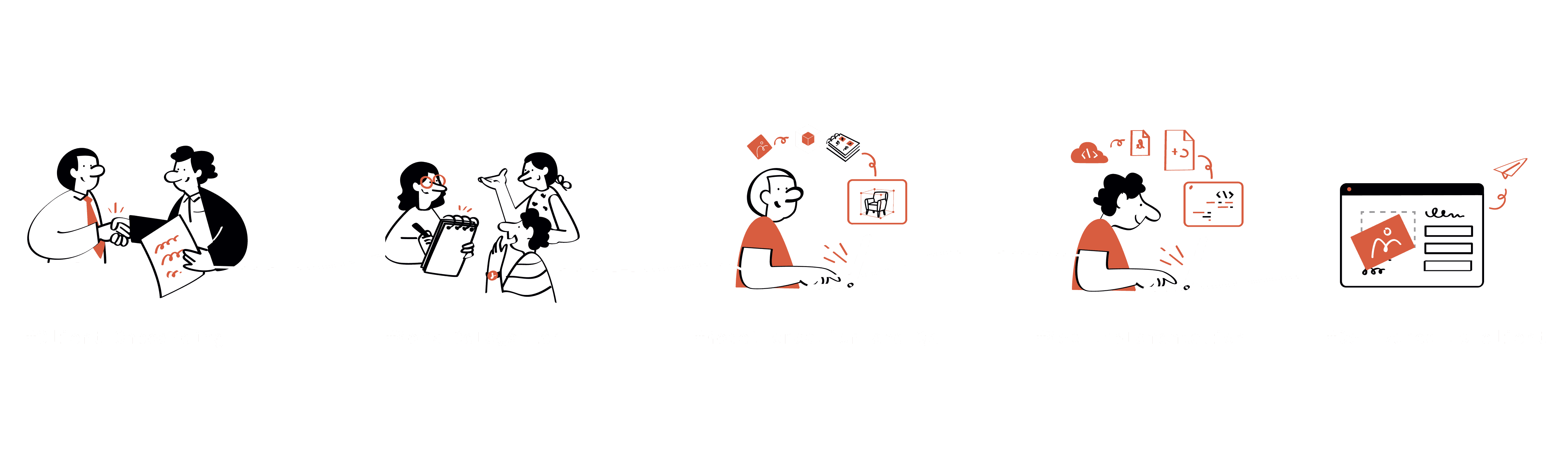
Hey there! I know reviewing case studies can be exhausting. But stick with me – this isn't just another design story. It's about how we transformed a chaotic, burnout-inducing process into a streamlined platform that gave multiple teams their nights and weekends back.


A unified platform that cut 10 rounds of revisions
My role
As the only UI/UX Designer, I owned the entire product creation process from research to implementation. I mapped complex workflows, designed intuitive interfaces that mirrored e-commerce layouts, built a standardized component system, and made strategic decisions that streamlined development
Team
Me:), 1 Co -founder / 3D Manager, 1 Product manager, 2 Devs
Duration
3 Months | Design sprint | August 2024 - Oct 2024
What is Ikarus Delta?
Ever customized a sofa's fabric or swapped out table legs and watched it transform before your eyes? That's us.
We turn static products into dynamic 3D experiences, helping shoppers confidently make decisions without touching physical items. And in 2024, as our client roster expanded, we faced our biggest challenge yet...

These 3D configurators are what we deliver to clients. But before diving into my project, let me explain the challenges we faced behind the scenes...
Where the problems began
In our monthly cross-functional meeting, tensions were running high. 3D artists voiced frustration over endless feedback loops. Developers described the strain of rebuilding configurators from scratch for each client. And as the lone designer, I explained how creating custom solutions repeatedly was hampering innovation.


Tech Lead
3D Artist
Me :
So what's the plan?
Create a standardized 3D configurator platform to work across all client projects. Our Product Manager proposed this meta-solution: instead of rebuilding each configurator from scratch, create a white-label system to make them efficiently.
This platform would free 3D artists from endless revisions, give developers reusable components, and provide flexibility for different project requirements. Exciting? Absolutely. Easy? Not even close. But here's where it gets really interesting...
Why are we solving this problem?
Simple. Our client roster was expanding, but our processes couldn't scale. Each project required starting from scratch – custom 3D models, custom code, custom designs. What should have been a streamlined process had become a resource-intensive nightmare.
Sounds straightforward to fix, right? Just standardise! Ha! If only.
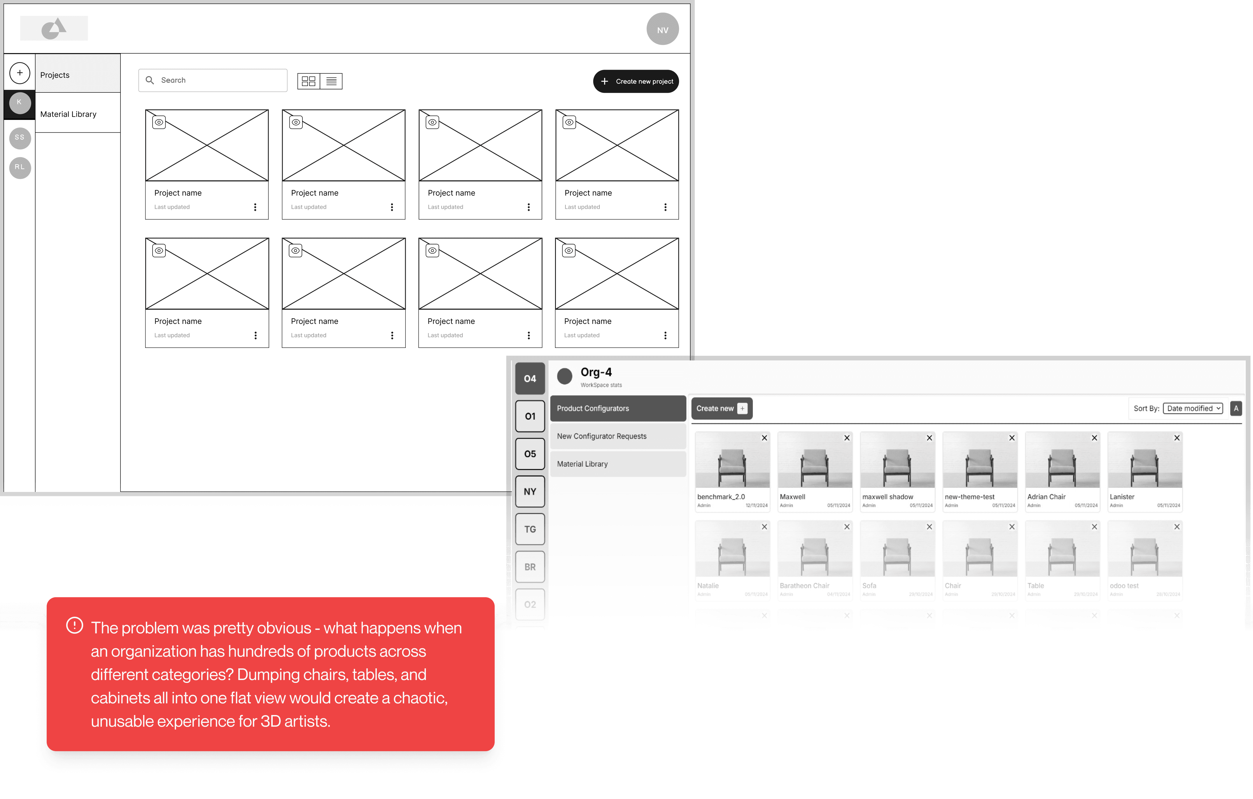
We're talking about creating a platform that would serve multiple teams with different needs: 3D Artists, 3D Artist Managers, and the Tech Team. Each with their own workflows, constraints, and pain points.
Understanding the problem and the current process
After the company-wide meeting where teams voiced their frustrations, I knew we needed to understand the problem more deeply. Instead of jumping straight to solutions, I spent a month immersing myself with different teams, mapping their journey from client onboarding to final delivery. I could see the bottlenecks in the process, but I needed to understand why they were happening.

# With 3D Artists
Shadowed their workflow from model creation to implementation
Observed the tedious QA feedback loops
Documented their late-night struggles with revisions
# With Developers
Reviewed their process of creating custom interfaces
Mapped out integration challenges
Understood the technical constraints they faced

Mind mapping to the rescue
It entails how everything interrelated
Conclusion of my deep investigation
By mapping the relationships between problems, patterns emerged which helped me see we weren't dealing with isolated issues, but a systemic problem affecting the entire workflow. With this bigger picture in view, I identified these key insights:

High priority insights
Environment mismatch
3D artists spent hours perfecting models in QA loop only to find they looked different when implemented on the web. Inconsistent lighting, camera angles, and shadows
Deadline pressure
Artist worked for late-night sessions to meet deadlines while juggling with both new models and revisions of earlier one's.
Workflow chaos
Artists juggled multiple platforms to track assets and communicate changes, causing crucial details to be missed or repeated.
Reinventing the wheel
Developers spent 60% of their daily time rebuilding similar functionality with slight variation rather than creating reusable components
The handoff marathon
Each configurator required 10-15 rounds of back-and-forth to properly integrate all components
Maintenance over progress
Developers spent more time fixing issues with previous deliveries than building new ones which should be automated as of now
Looking how other are solving this problem?
I thought, "How do we make this actually work? It's not like we're designing a shopping app!" It's more like creating a LEGO set where you snap model parts together to build something cool on the web, if you get what I mean.
We have got pain points and insights throughout the journey. So I dove into competitive benchmarking to see how others were tackling similar problems. What was working? What wasn't? And most importantly, where could we innovate to make something better than what already existed?

“ Direct competitor ”


“ Indirect competitor ”

After examining platforms like Zakeke and Combeenation, clear patterns emerged about what makes a successful configurator experience – and what creates frustration. These insights directly shaped our solution strategy:
Strengths to build upon
Direct Model Visualization & Editing to solve environment mismatch
Intuitive hover-based interactions for component selection
Real-time visual feedback to eliminate back-and-forth revisions
Automated metadata extraction to reduce manual work
Using familiar terminology language and concepts already familiar to our 3D artists, avoiding the learning curve.
What to avoid
Overwhelming interfaces with complex hierarchical structures
Tedious Control Setup for creating customization options feels cumbersome and time consuming.
Technical barriers requiring coding knowledge for basic actions
Starting from scratch for similar projects
Our opportunity
Build a streamlined, single-environment solution with familiar terminology, reusable templates, and no-code controls tailored specifically to our workflow.
Setting the Ground Rules
With all this research in hand, I needed to build a bridge from problems to solutions. Design principles would keep us on track and prevent us from creating just another complicated tool. Here are the four rules I created to guide our work:
Simplify
Empower
Maintain


Reusable
Guidelines
Design Principles
Time for making layout and wireframes
Before sketching wireframes, I needed to decide how to structure our editor. I asked myself: "What layout would feel immediately familiar to our 3D artists?" The answer was right in front of me - the e-commerce product pages our configurators would eventually appear on.
Making the Layout Choice

Reason
Scale Image
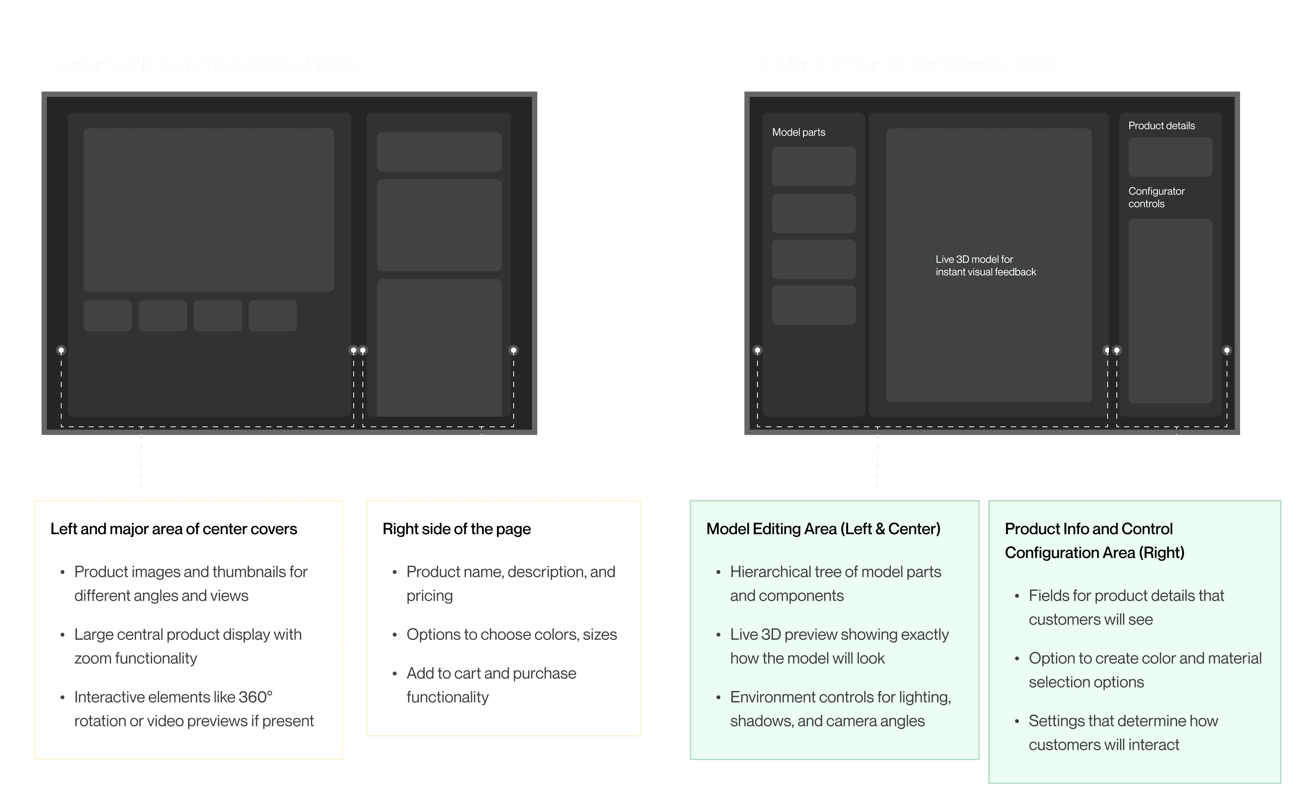
By mirroring the familiar e-commerce and preview layout in our editor, we directly addressed our core problem: the disconnect between the creation environment and final implementation. This approach reduces cognitive load for 3D artists, creates an intuitive connection between editing and output, and ultimately eliminates the revision cycles caused by environment mismatch.
🚨
The reality check
When I started wireframing, I assumed our platform would work like competitors' - automatically patching materials to uploaded models. But during a pivotal discussion with the tech team, I discovered we create models from scratch based on client photos, with materials being the reusable elements across projects.
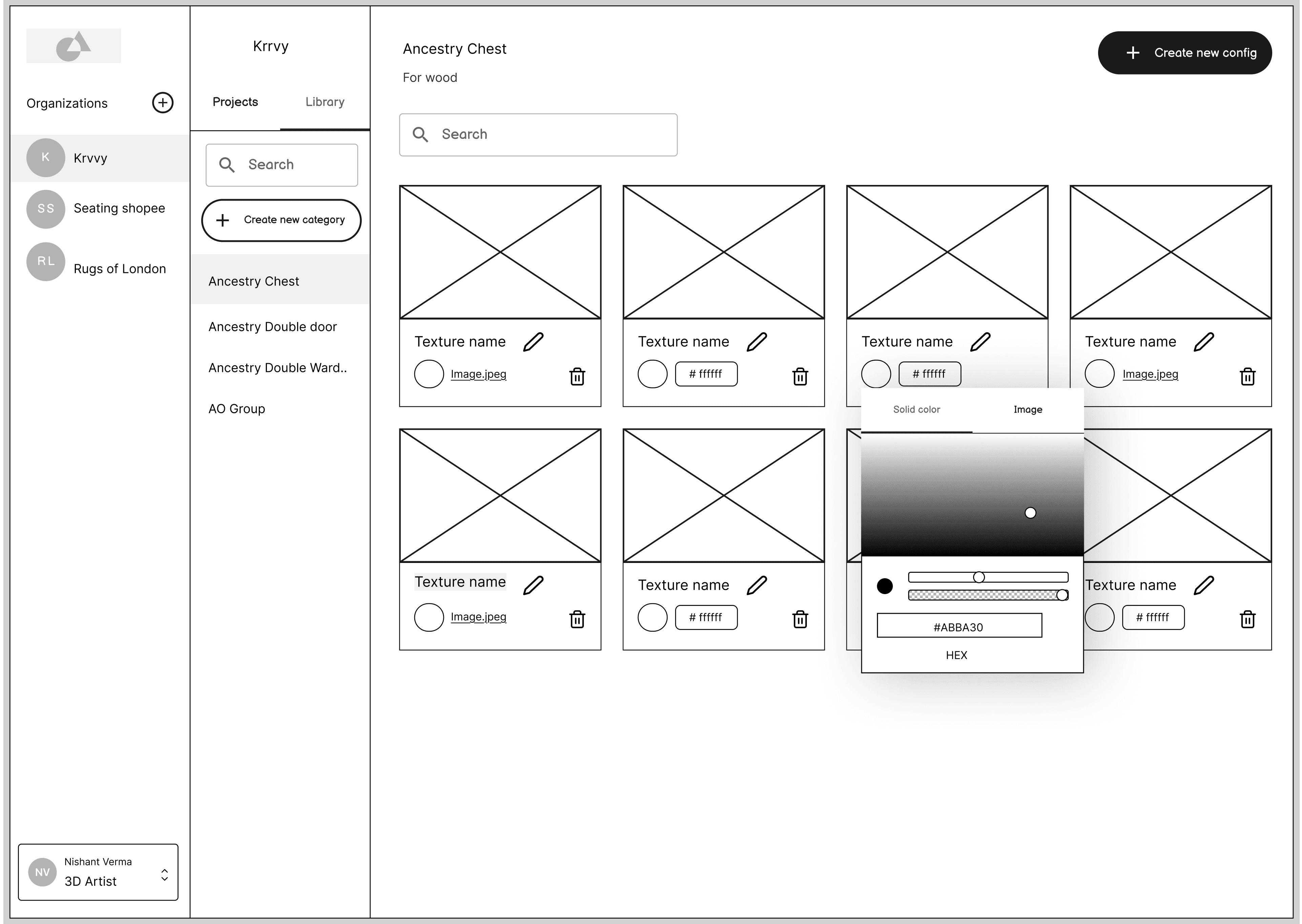
This insight completely shifted our approach. Instead of building a model library like competitors, we prioritized a robust material library system for reusing textures and finishes. This constraint ultimately made our platform more efficient for our specific workflow - proving that understanding your unique context beats copying industry standards.
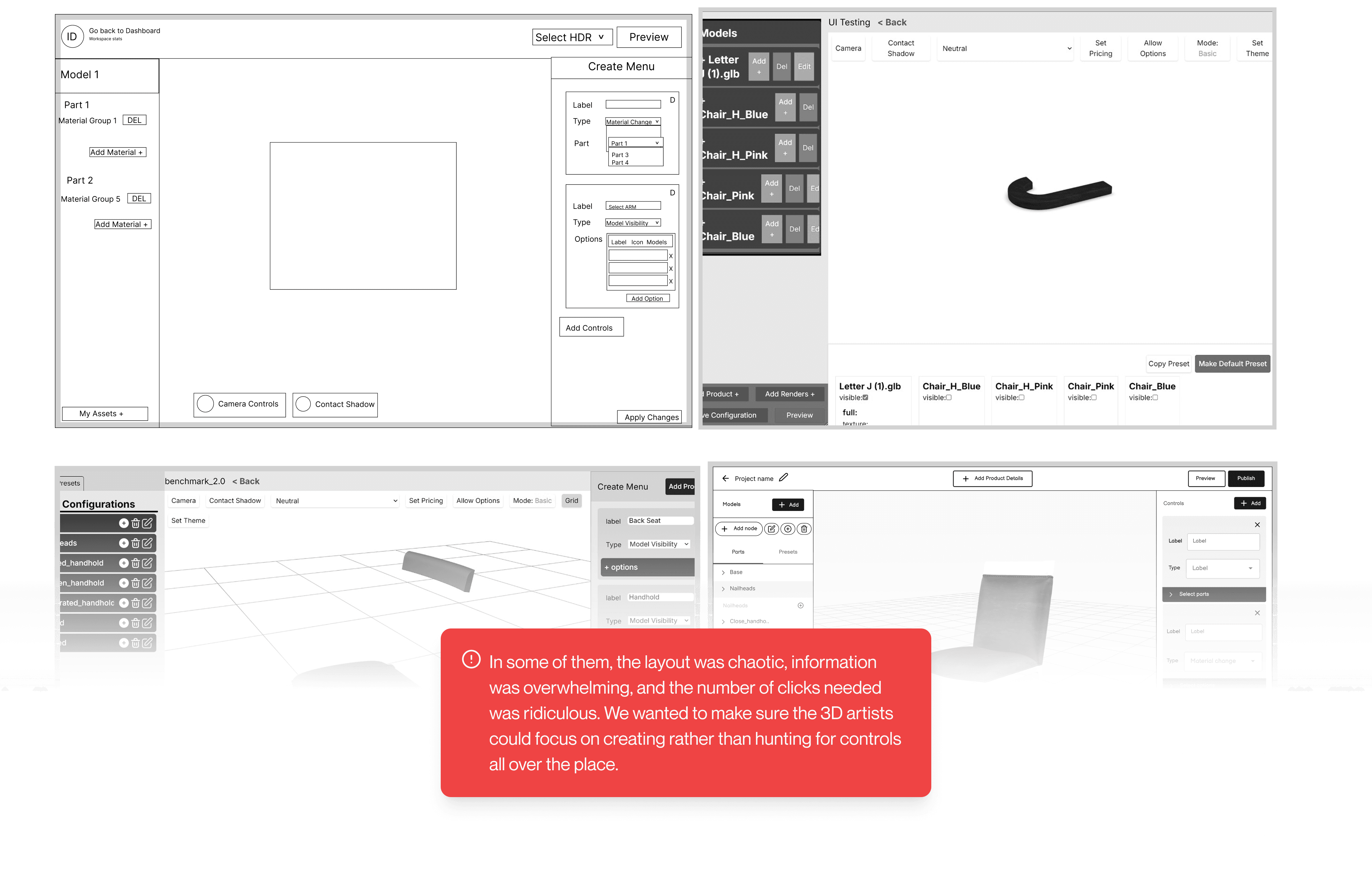
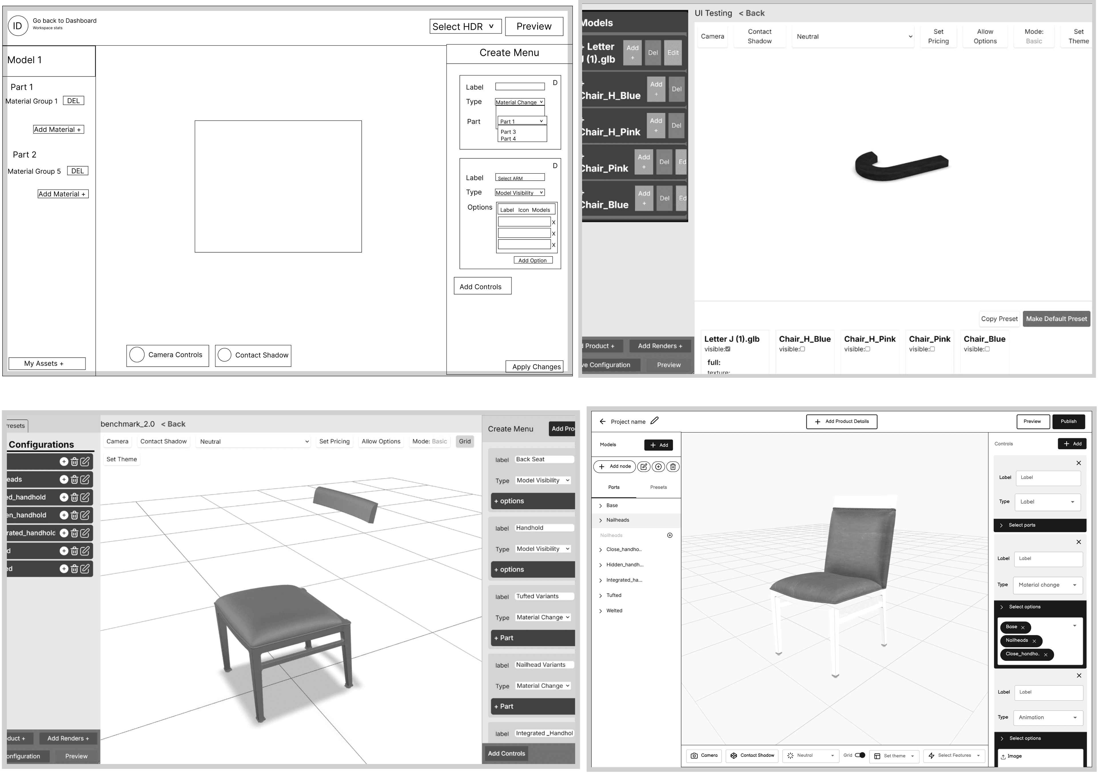
Reinventing the complex 3D scene Editor
See the thinking behind it
Switch between versions
Need a closer look?

Reason
Iterations
Final
Organisation and file view
Reason
Iterations
Final
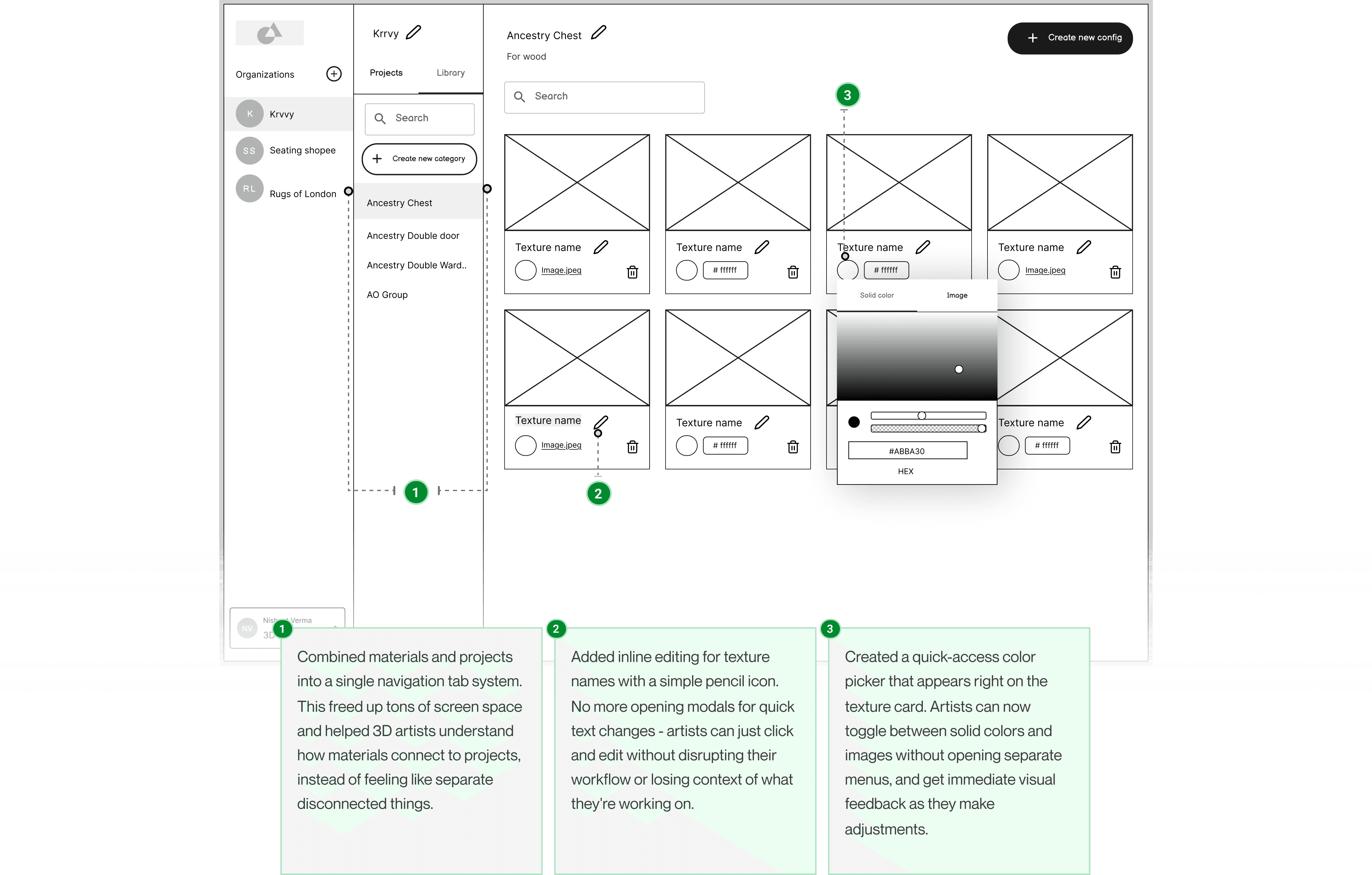
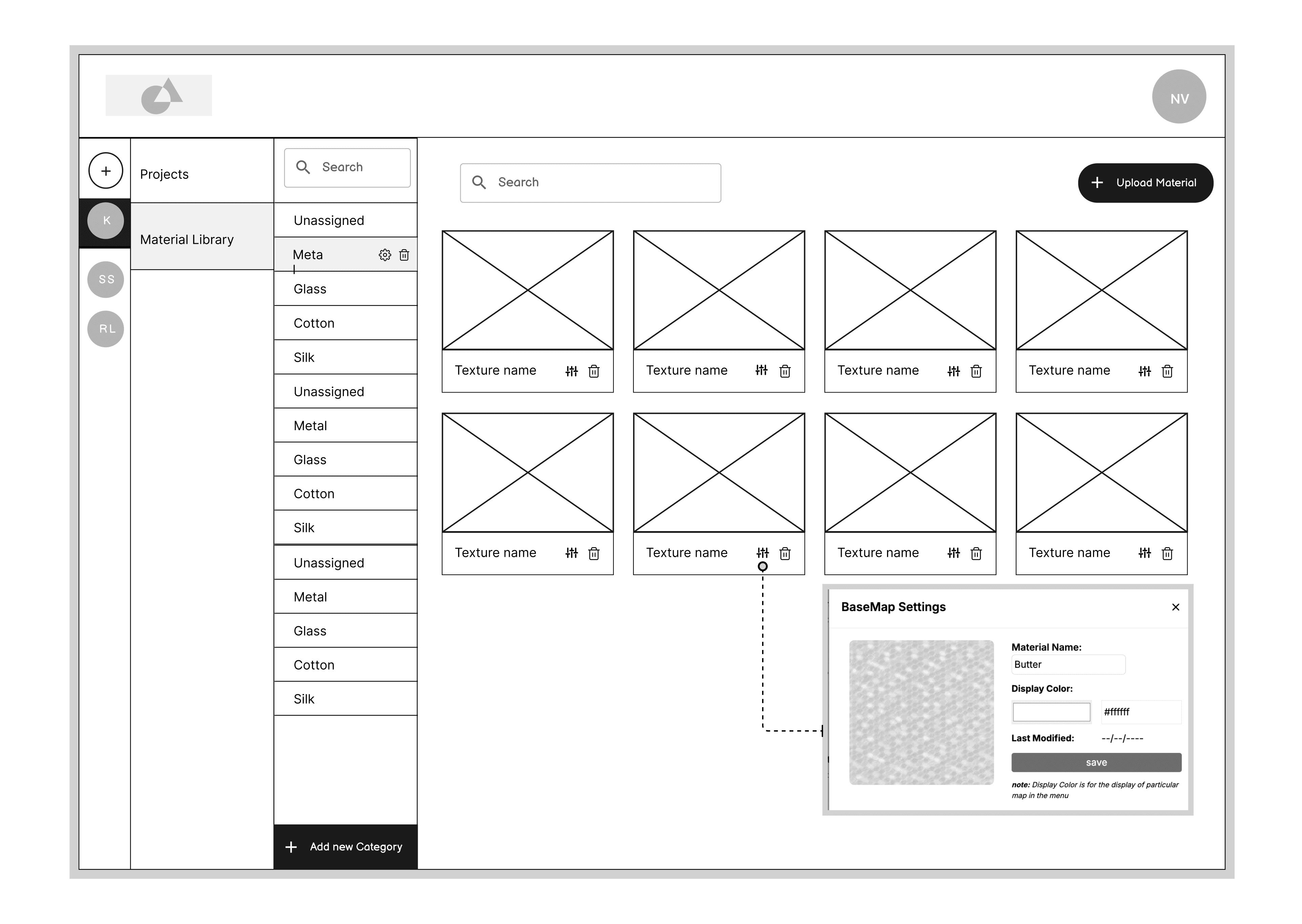
Managing material and their textures
Reason
Iterations
Final
This is where I get to geek out – the fun part where all those sketches and wireframes turn into something visual that makes you go "oooh!" I love watching a product come to life through colors, typography and components that just feel right together. Time to make this baby shine!
Sitting with developers to speed up our build time
To speed up development, I spent time with our engineering team to understand their workflow. I discovered that using an existing component library would be much faster than building everything from scratch.
After evaluating several options the tech team suggested, I chose Hero UI because it offered the most complete set of components, supported both light and dark modes (important for 3D artists who often prefer dark interfaces), and was actively maintained with regular updates.


Adopted the pre-built UI for our brand
A look at our component system and style guide
background
#FFFFFF
foreground
#11181C
divider
#D4D4D8
focus
#CF462A
Default
#D4D4D8
Primary
#CF462A
Secondary
#FEF3F0
success
#17C964
warning
#F5A524
danger
#F31260
default-50
#FAFAFA
default-100
#B99CFC
default-200
#E4E4E7
default-300
#D4D4D8
default-400
#A1A1AA
default-500
#71717A
default-600
#52525B
default-700
#3F3F46
default-800
#27272A
default-900
#18181B
primary-50
#f9e9e8
primary-100
#fbccc0
primary-200
#f9ab98
primary-300
#f78a70
primary-400
#f77052
primary-500
#f65837
primary-600
#ec5233
primary-700
#de4c2e
primary-800
#cf452a
primary-900
#b53b23
success-50
#E8FAF0
success-100
#E8FAF0
success-200
#A2E9C1
success-300
#74DFA2
success-400
#45d483
success-500
#17C964
success-600
#12A150
success-700
#0E793C
success-800
#095028
success-900
#052814
warning-50
#FEFCE8
warning-100
#FDEDD3
warning-200
#FBDBA7
warning-300
#F9C97C
warning-400
#F7B750
warning-500
#f5a524
warning-600
#C4841D
warning-700
#936316
warning-800
#62420E
warning-900
#312107
danger-50
#FEE7EF
danger-100
#FDD0DF
danger-200
#FAA0BF
danger-300
#F871A0
danger-400
#F54180
danger-500
#F31260
danger-600
#C20E4D
danger-700
#920B3A
danger-800
#610726
danger-900
#310413
Colors
4XL
36px
Line height: 2.5 rem
A New Moon is Rising
3XL
30px
Line height: 2.25 rem
A New Moon is Rising
2XL
24px
Line height: 2 rem
A New Moon is Rising
XL
20px
Line height: 1.75 rem
A New Moon is Rising
L
18px
Line height: 1.75 rem
A New Moon is Rising
M
16px
Line height: 1.5 rem
A New Moon is Rising
SM
14px
Line height: 1.25 rem
A New Moon is Rising
XS
12 px
Line height: 1 rem
A New Moon is Rising
Try to avoid this size, use only if necessary.
This is our base font size.
Typography
When reviewing the Hero UI component library, I discovered they were already using Inter font- an excellent choice for typography system that prioritizes readability and efficiency, especially when scanning complex 3D model hierarchies and configuration options.
Rather than changing the typography and creating additional development work!!
>= 1280px (12 columns)
Heading
This is a subheading
16px (gutter)
32px
(margin)
UI Components
foreground
#11181C
Radius
Grid System
.shadow-2xl
.shadow-xl
.shadow-lg
.shadow-md
.shadow
.shadow-sm
Shadows
.rounded-full
(50%)
.rounded-large
(14px)
.rounded-medium
(12px)
.rounded-small
(8px)
UI Components
Inputs
Email Address
hello@ikarusdelta.com
Email Address
hello@ikarusdelta.com
Email Address
hello@ikarusdelta.com
Please enter your email address
Email Address
Megan@gmail.com
Email Address
Megan@gmail.com
Email Address

hello@ikarusdelta.com
Search in organization
Augmenrl;jcrpjoprjcpted Reality
frhjihorfhio
nkldrkncfiohcfip
ckllcfnifo
nckfcnncf
Animation
Toggle
On
OFf
Segmented Control
Primary Action
Button
Secondary Action
Button
Radio:unchecked
Checkbox:unchecked
Primary Action:hover
Button
Secondary Action:hover
Button
Radio:checked
Checkbox:checked
Primary Action:active
Button
Secondary Action:active
Button
Radio:hover
Checkbox:hover
Primary Action:disabled
Button
Secondary Action:disabled
Button
Radio:disabled
Checkbox:disabled
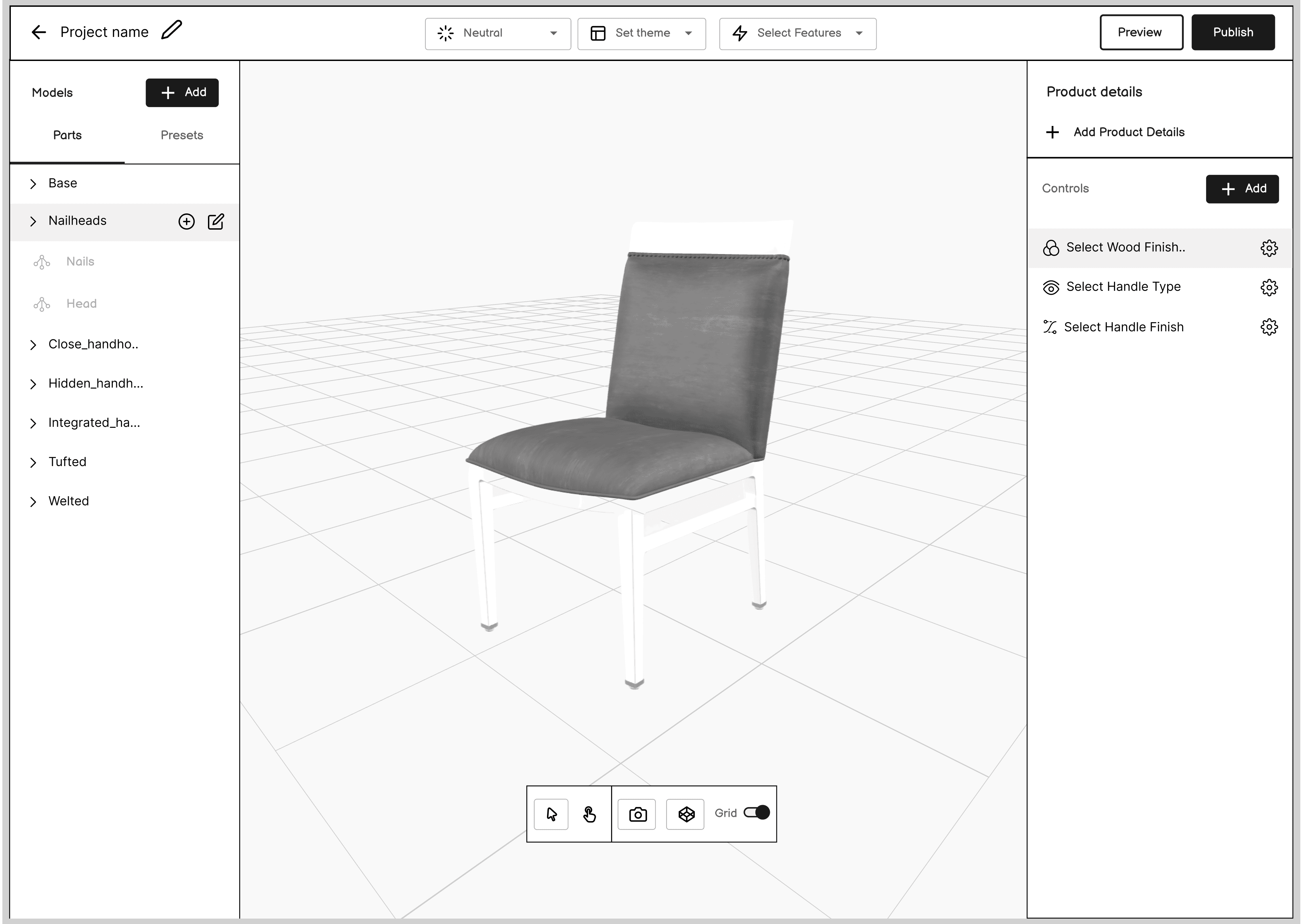
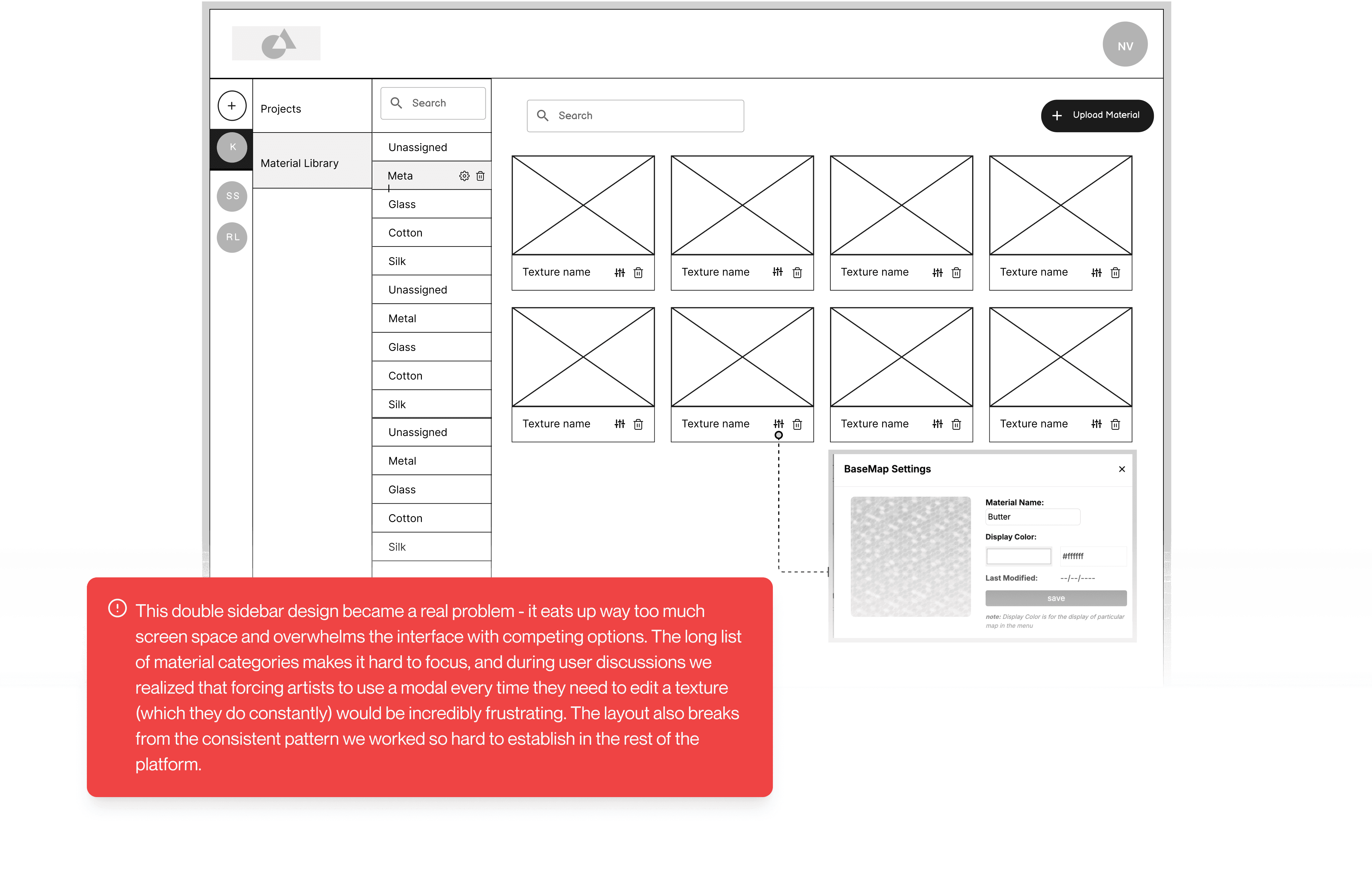
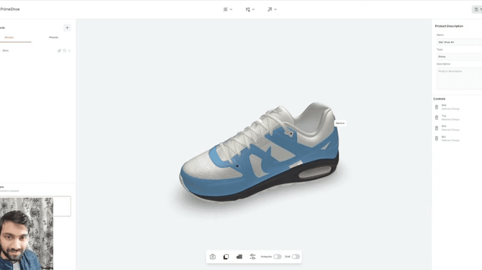
Fresh look at our 3D scene editor: Where 3D artists work their magic

Smart organization for growing product catalogs: Organization and Project management

Material library: Reusable assets for faster creation

A whole new way of adding controls
Here's where the design really comes together - a simple modal for creating controls that immediately shows up on the right panel. No more accordion mess or endless scrolling. 3D artists can quickly build options for customers while seeing exactly how they'll look and work.

Model Visibility
Material change
Animation
Controls
Name
Glide/ Caster
Type
Model Visibility
Status
Independent
Add Options
Name
Glide Cover
Select Part
Glide-Cover
Name
Metal Glide
Select Part
Metal-Glide
Save Controls
Controls
Name
Leg
Type
Material Change
Select Part
Search Part
Meash005
Meash005_1
Meash005_2
Boxed_seat
Pullover_seat
Glide_cover
Metal_glide
Metal_glide
Plastic_glide
Save Controls
Controls
Name
Select Wood Finish
Type
Animation
Add Options
Adjustment - 1
Select
Animation
Welted, nckndionio, dc..
Name
Adjustment - 2
Select
Animation
262626_cijcsi
Save Controls
Controls
Add control
Select Wood Finish
Select Handle Type
Select covers
Select height
This prototype demonstration is clickable - You can interact with it once you see all the hotspots
Quick actions that stay out of your way
These popovers give 3D artists what they need, right when they need it. No more jumping between screens or losing sight of the model - just click and edit right where you are. Feature selection, part editing, and theme changing all happen in the same view, keeping the focus on the model itself.
Cabinet Demo
Models
Add model
Parts
Presets
Closed_handhold
Base
Leg
Seat
Glide_Cover
Back_top
Hidden_handhold
Integrated_handhold
Add material Group
Search Material Group
Ins_Chest
Fabric
Inspiration_SingleD...
wood
Ins_DoubleDrawer
Ins_SingleCabinet
Ins_SingleCabinet
Ins_DoubleCabinet
Edit Part
Name
Leg
Select Nodes
Ins_Chest
Fabric
Inspiration_SingleD...
wood
Select Features
Measurement
Augmented Reality
Zoom in/ Zoom out
Full Screen
Screenshot
Select Environment Lightings
Search Lighting
neutral
panorama
lebombo_1k
Moon_1k
Pillars_1k
Select Theme
Version - 1
Version - 2
Version - 3
This prototype demonstration is clickable - You can interact with it once you see all the hotspots
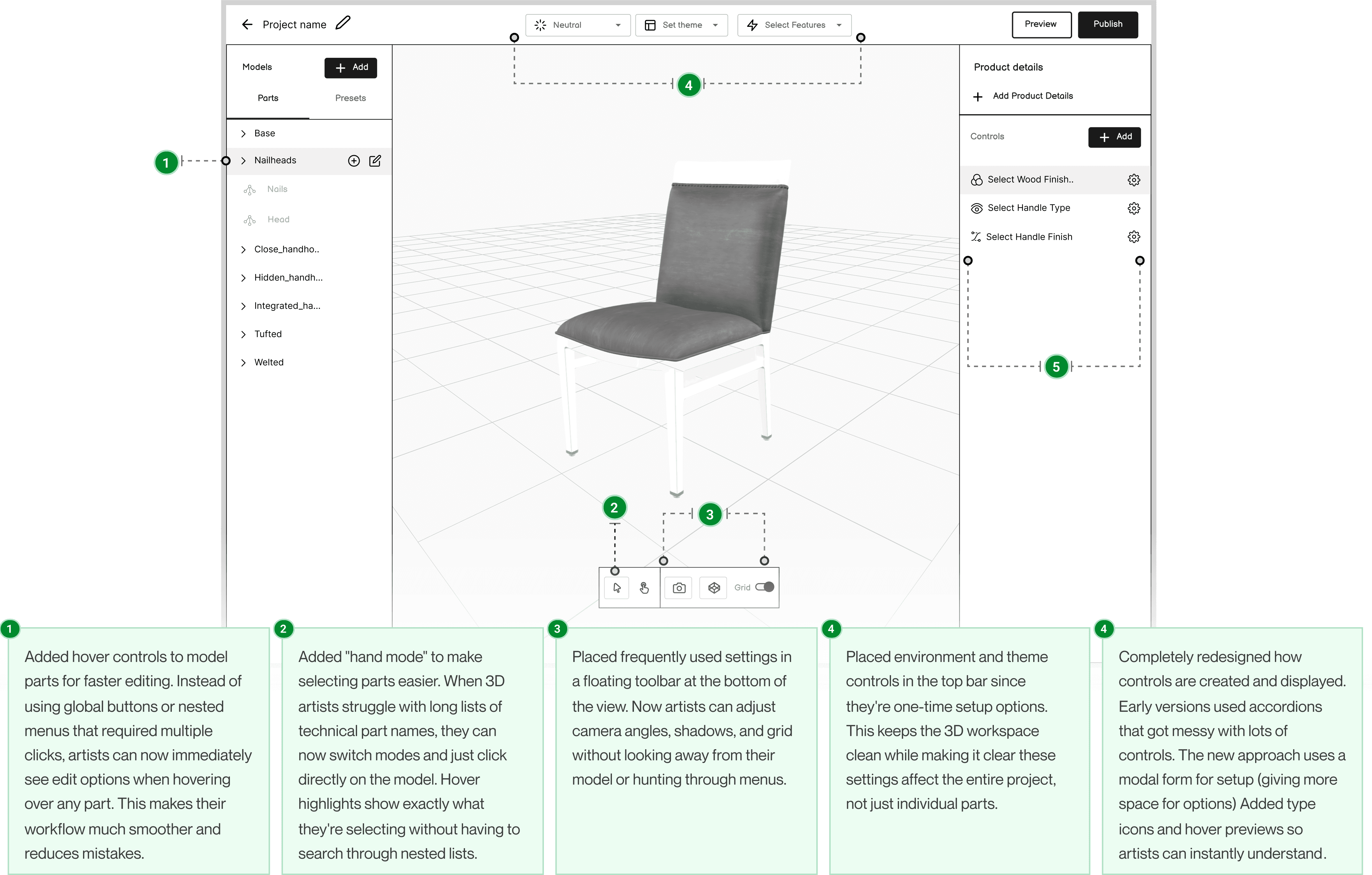
Sitting once again with 3D artists to make their life simpler
Design isn't a straight path from A to B. After building most of the interface, I circled back to the 3D artists to tackle their most frustrating daily tasks - setting up cameras and environments. Through collaborative card sorting, we completely rethought how these controls should be organized, focusing on their mental models rather than technical specs.

Gathered around 3D experts and cooked this up

Grid
Hotspots
View
FOV
0
Max Distance
0
Max Distance
0
Camera Physics
Damping
0
Position
0
X
0
Y
0
Z
Appearance
Scale
0
Opacity
0
Blur
0
Viewpoint
0
Near
0
Far
Shadow Influence
0
0
Logically grouped with more intuitive layout
This prototype demonstration is clickable - You can interact with it once you see all the hotspots
Making it blend seamlessly with any e-commerce site
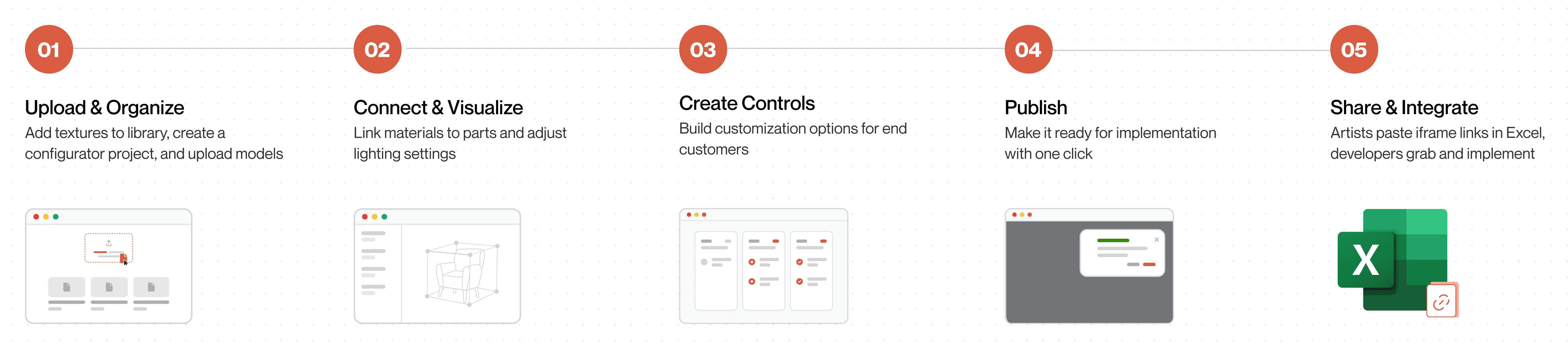
The final piece was creating flexible themes that work across different product categories - furniture, bags, desks - you name it. These templates adapt to each client's brand while keeping all our powerful features intact. Best part? Developers can add the entire configurator to any site with just a single iframe snippet.


The impact: From endless loops to smooth sailing
Take a look at our journey before and after the new platform. The chaotic loops between model creation and web implementation disappeared, replaced by a streamlined workflow where each step flows naturally to the next.
Before
After
Hover to know what really happened
How Things Improved
70%
⏱️
Faster configurator creation
What once took 3 weeks now takes just 7 days, eliminating the endless back-and-forth between teams.
50%
🎯
Improved on-time delivery rate
Project completion rates jumped from 40% to 90%, dramatically improving client satisfaction and reducing stress across all teams.
🔄
Two teams to independent workflows
3D artists create configurators without developers, who no longer wait for model updates. A complex dance became two efficient parallel processes.
💼
Strengthened business development
Our platform serves as a powerful demo during pitches, allowing sales to show configurations on the spot and win larger clients.
📋
Works with existing processes
3D artists still use familiar Excel sheets but now paste iframe links when done, requiring minimal training.
What this journey taught me?
Other than discovering I could lead a complex platform design as the only designer on the team, here are my learnings:
Trading off features for a viable Version 0
Watching the product manager prioritize features after my research was eye-opening. Focusing on core problems meant setting aside "nice-to-haves" like built-in messaging between 3D artists for later, showing me how strategic feature selection helps ship something useful rather than chase perfection.
Creating solutions that fit existing workflows
By sitting with developers, I designed solutions that integrated with current processes instead of disrupting them. The simple approach of adding iframe links to Excel sheets meant minimal changes with maximum impact.
Finding opportunities in ambiguity
Working on a new type of platform meant there was no clear roadmap to follow. I learned to embrace the uncertainty and use it as a chance to explore creative solutions rather than being paralyzed by the lack of direction.
Choosing tools that benefit everyone
Using Hero UI saved development time and made handoffs smoother. This experience showed me that good design decisions extend beyond visuals to include practical considerations that help the entire team work efficiently.
